our university website turns 30!

Our University website turns 30
Nelson Mandela was sworn in as president of South Africa, the Channel Tunnel opened for the first time and the National Lottery was launched; 1994 was quite the year!
Another event which took place this year? The first ever University of York website went live.
Here we look back at how the University website has evolved over the past 30 years.
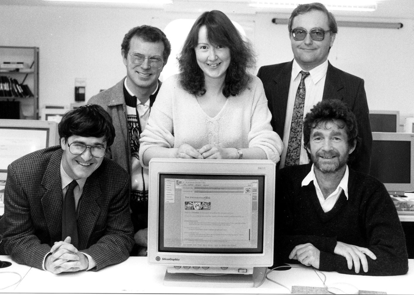
Originally called ‘YorkWeb’ the idea for creating a University website began when Mike Brudenell, a member of the Systems Group of what was then Computing Service, spotted an article describing work by Tim Berners-Lee and something called the 'Worldwide Web.’
Curious, Mike downloaded the software and began to play around with it. He was immediately fascinated. For the previous few years University information such as reading lists, academic and administrative information had been stored in an Information Server but this new website software allowed the information to be viewed in a much more usable way.
After showing his mini test site to Head of Systems, Dave Atkin, the decision was made to retire the Information Server and move all of the content on it to a website instead.
Mike set up the web server software and storage that would hold all the information, whilst Dave wrote conversion programs to extract the menus and pages of data out of the Information Server and convert them into the HTML markup language which could be used for the web.
Julian Richards was the IT lead in the Archaeology department at the time the website was launched and acted as the academic representative for the project, migrating the department's information from the existing Information Server to Yorkweb, providing an example of how it would work for other departments.
“It (setting up Yorkweb) was seen as a really positive move, the University has always been good at keeping ahead with IT developments. This project was very much a whole University activity, it required a lot of effort from departments.”

"It was seen as a really positive move, the University has always been good at keeping ahead with IT developments."
Launch day
The launch day for YorkWeb was set for the 19th September, the start of the academic year. Mike describes in his blog celebrating the 20th anniversary of the site, that ‘this was a big thing: there were very few websites in the whole world, let alone the UK!’
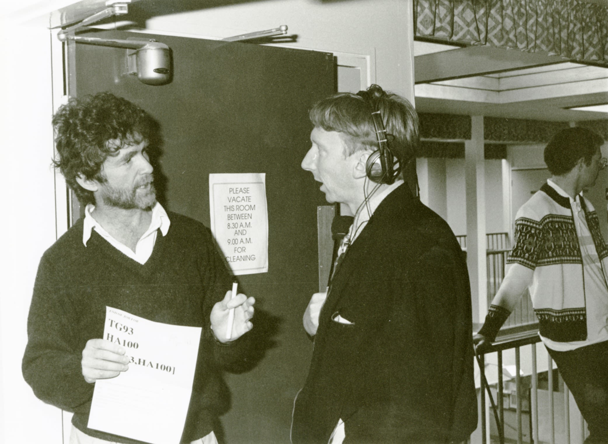
It was a big enough thing for it to be covered by local press including Radio York who came to the University to interview John Byrne about what was happening.
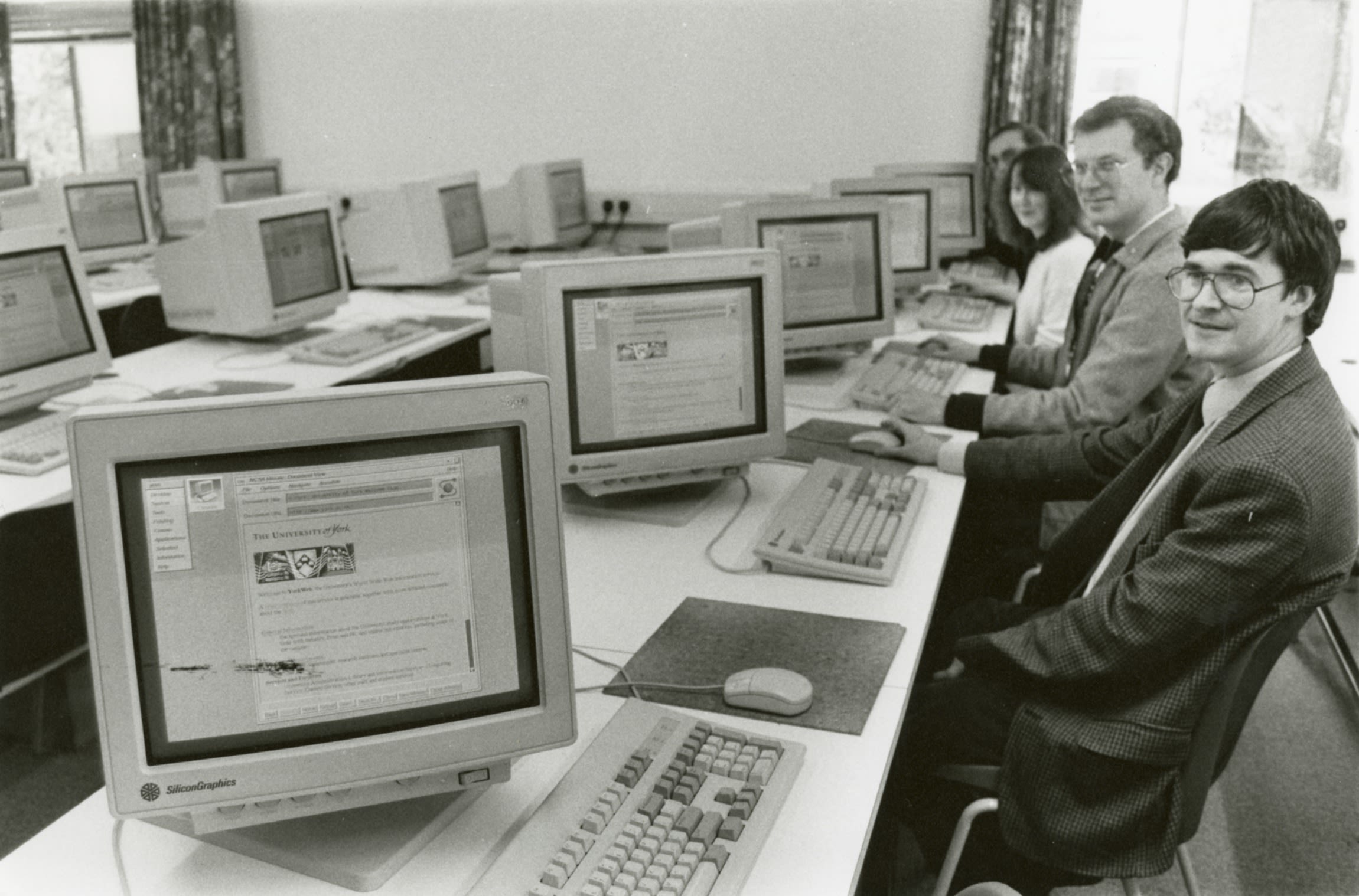
The launch was held in D/104, the SGI Indigo workstation classroom, as it was the only room which had a significant number of devices capable of displaying the new website in all its glory.
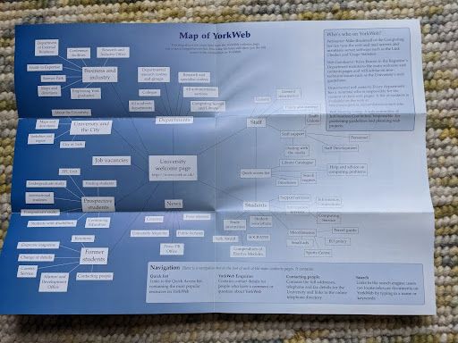
The below ‘guide to YorkWeb’ was shared with University staff and students to explain our reasoning for setting up a dedicated University of York website, and mapped out the structure of the site. It’d take a lot more than a one-page leaflet to map out all the pages on the website today!
An October article in the University magazine described that whilst all departments had a page listing basic information, the ambition for each department to have their own comprehensive entry on the site ‘as the web is set to become a key player in information provision to University applicants.’
Find out more about what happened on the day in our interview with Mike Brudenell.
"I think York was likely one of the very first UK universities to have its own web service, especially a service filled with so much content..."
Looking back
Read about the key developments to the University website over the last 3 decades
1997
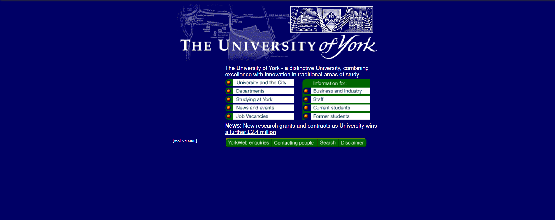
November 1997 brought the first ‘proper’ design to the website homepage, replacing the straightforward list of links and text with a first use of colour and buttons. The brief given to the design firm working on the pages was to ‘reflect the academic nature of the University in a visual style which was welcoming and friendly. Metadata was first used for search engine optimisation.
A new structure was also introduced which was designed to make it easier for main users to locate ‘the information most relevant to them easily and quickly.’ Users of the website were invited to leave their feedback on the site and a working group was set up to review it.
2002
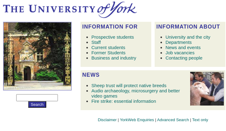
2002 saw some key introductions to the website, images were included on the homepage for the first time as well as a ‘news’ section and a search box using a webform. The heavy-graphic of the 1990s was replaced with a cleaner, more modern look and the page became less static.
There were some other introductions to the site aside from those to improve the design. The ability to add access control to directories and encryption facilities were important security features of the site.
2006
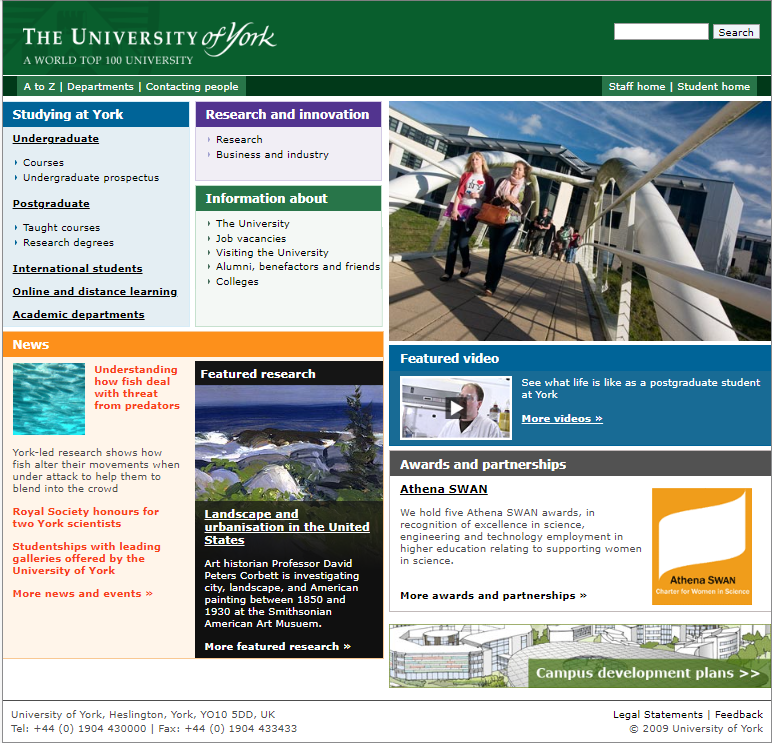
In early 2006 the homepage was updated to a style that included more imagery, more colour and a green masthead. This design would remain for the next seven years.
2008
A centralised Web Content Management system was introduced for the first time, meaning content on the web could be added and edited without any needing technical knowledge or specialist software.
2010
A horizontal menu bar was introduced in 2010 which was designed to make it easier to get key audiences to the desired part of the website. A media carousel was also introduced.
2013
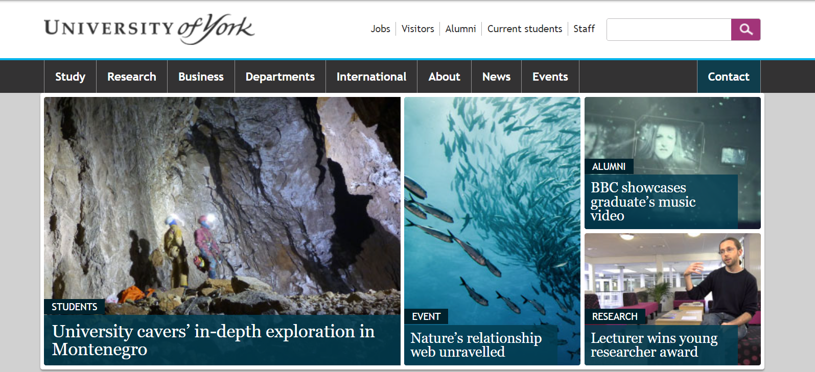
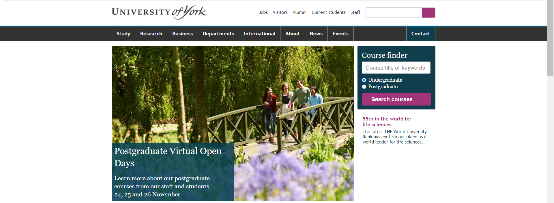
2013 marked a major restyle for the site using the teal, grey and pink we’re familiar with today. A ‘course search’ function was also added to the homepage, allowing students to find information on courses without having to click through the website.
2014
The first role fully dedicated to producing content for the website, Digital Editor for Recruitment, was recruited to. One of the first focuses for this new role was to revamp our existing content to appeal to prospective students.
2015
By 2015, mobile devices are beginning to account for the majority of website traffic. To make sure we were creating pages which could adapt responsively for these mobile devices, the Digital Pattern Library was introduced. It also helped make our website more consistent by standardising commonly used components.
2019
Digital accessibility became a major focus in 2019 with the introduction of legislation requiring public sector bodies to ensure their websites can be used by everyone, regardless of any disabilities.
2021
In 2021 focus began on content strategy (thinking about the full content life cycle) and improving the overall governance of the website. Lots of things had grown organically over the years so we had to start to consider what all of our content is, whether it’s needed, who can/should edit it, etc. 2021 also marked the beginning of a big project to overhaul academic department websites, which make up a big proportion of our web estate.
What's next?
We’re currently working on rolling out the University’s updated brand via a new version of the Digital Pattern Library, this will bring a new look and feel and performance improvements to the site.
We’re also beginning to see an increased awareness of the environmental impacts of digital communications such as websites. The internet consumes a lot of energy- servers and data centres need it, as do the phones and laptops we use to view websites and then there's energy used to send data across networks. One of the things we’re currently doing to reduce the carbon footprint of the University website is to introduce ‘lazy loading’ of images in some places. This means that rather than loading everything as soon as someone views a page, images are only loaded when they're needed. We use this on the homepage so that images further down the page only get loaded when someone starts scrolling down to the bottom of the page.
As the use of generative AI also continues to grow across all sectors, especially digital, it is likely any future plans for the website will need to respond to this growing phenomenon
30 years (ish) in 30 seconds
Interested in how the design of our website has changed over the years? Take a look at this video showcasing 30 years of the homepage in 30 seconds.
